Three Updates: New User Interface!
This is the second in a series of three posts about The “Should Have Been Three Updates” Update, which, as you can probably tell from the name, was really too big for a single update. The first post is about the new fancy version of the Veranda level. This post is about the new user interface we’re moving towards. The final post will be about the five new characters.
I don’t really have hard data on this point, but I think people may make more fun of how ugly the original SpyParty User Interface is than the original in-game character and level graphics!
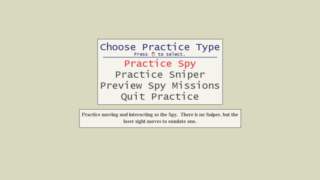
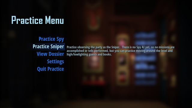
You can drag the handle in this image to compare the versions!
We’ve been working on a redesign of the UI—well, okay, a design of the UI because the original one wasn’t really designed so much as accumulated—for a while now, and it’s finally starting to find its way into the game you can download and play.
The goal behind the new UI is to make SpyParty look like an actual professionally made video game that’s pleasant to look at and for which you might want to pay money. I mean, of course the UI should be easy to use for new players, not get in the way of elite players, and still provide a lot of customization options for exploring the space of the game design, but let’s not discount the importance of just simply not being butt-ugly.
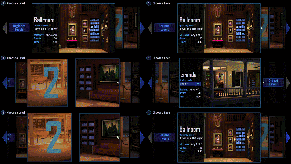
Here’s a small gallery of images from the new UI:
I originally revealed the in-progress new UI back in June, 2016, in a stream on the SpyParty twitch channel (and I archived it on the YouTube channel and embedded the video below), but the first time anybody besides me could actually get their hands on it was at PAX 2016. Because we use console controllers at PAX,1 I had to not only get all the UI implemented, but all the focus handling and controller navigation stuff had to work as well.
PAX went off pretty well, finding us lots of bugs and awkward things about the new UI’s usability, and we were able to iterate a bit before finally releasing the first version of it into the wild at the end of October, 2016.
Once the build was in beta players’s hands, they found many more issues. PAX is a good testing ground for whether something works at all, since you get a lot of slightly-random quick testing, but if you want to find out if a feature works well, especially for advanced play, people need to spend quality time with it and use it in anger.
One For The Price of Two
When I first started planning to implement the new UI, I looked around at a lot of libraries and products but I ultimately decided to implement it completely from scratch in C++ directly into the SpyParty codebase. I looked at doing it in HTML with many different technologies, I looked at doing it in Flash,2 I looked at custom solutions—I looked at just about everything. In the end, given the level of control, customization, flexibility, and performance I wanted, it made sense for me to just type it in.
Most of this typing was pretty straightforward, and from the beginning I tried to integrate all the fades and animation and sound effects into the controls so it was at least somewhat “real” and I didn’t have to go back and change major things. We did pretty thorough mockups, but of course, until people actually try to use things it’s really hard to know what works and what doesn’t, especially with something as finicky as user interfaces.
The game setup flow is one of the more complicated areas of the game, and I wanted to add a lot more flexibility and customization options in the future, so it was only going to get worse. I’ve actually blogged at length about some of the design challenges in previous iterations of the game setup flow, but those all felt temporary and I really wanted to nail it this time.
Because SpyParty is a competitive multiplayer game, the UI has to do double-duty: it has to be accessible to new players who just bought the game, and it has to be efficient for experienced players who are starting their two-thousandth game. Designing UI is hard enough for either one of those players, but trying to please both of those people at the same time is really hard, and the game setup screen is where these two types of players will be spending a lot of their non-in-game UI time.
So, we punted.
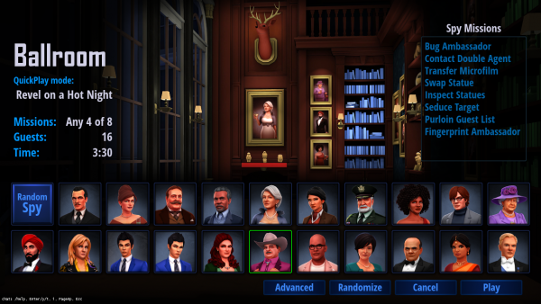
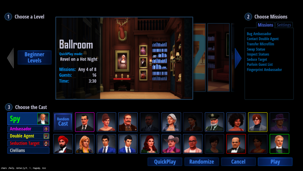
Or, at least we tried to punt. I figured a lot of the time people would just want to get into a game quickly, and having a randomly picked level with a balanced game type would be good enough. We codified this into the idea of QuickPlays, which are descriptions of maps and mission loadouts that are balanced according to the current meta, and then we made a QuickPlay setup screen that would just pick from these with only a few options. Then we also made an Advanced screen that had all the knobs on it, letting players fully customize each game. Here are the two screens we came up with:
The Advanced screen had this amazing level selection control I wrote based on a control from the Call of Duty Black Ops 3 Specialists selection. You can check it out in this TotalBiscuit YouTube video. I improved upon it greatly3 by making it silky smooth with no pops and nice ease curves everywhere, and, well, I was very proud of it and I don’t even want to know how long I spent working on it…
Things started to fall apart when it became clear people wanted to be able to choose their level on the QuickPlay screen; the screen was just a hair too simple without that. I tried to figure out how to put some level selection in there, and did a bunch of mockups, some of which you can see here:
By this point, the QuickPlay screen was rapidly turning into the Advanced screen, and it was obvious it would be better if I could just figure out how to merge them completely.
There were three big features on the Advanced screen that needed to be merged:
- the level selector
- the mission and game settings panel
- the cast selection widget
As they always say, you have to be willing to kill your babies, and the level selector was definitely my UI baby, but it needed to die. The full-bleed image with overlays on the QuickPlay screen was clearly superior design to the boxed and segmented layout of the Advanced screen, and I could not figure out how to do a full-bleed version of the level selector that wasn’t terrible, so I had to kill it. It had some other problems, like O(n) selection time, which is annoying even with acceleration, so the new widget for selecting the level at which we finally arrived has small icons you just click on and it changes directly to them. Still, I’ll always have a place in my heart for the funky slidey wacky level selector.
The mission and game settings panel could drop right into the QuickPlay screen with tabs behind the mission choices, so that was no big deal. The one subtle thing with this panel was I didn’t want beginners to even know the settings were there (you can now control all sorts of things that can mess up the balance of a game, like number of guests, which missions are prohibited, duration of the game, and more soon), so I extended the QuickPlay format the include groups, which is cool because now players can make their own for things like the SpyParty Competitive League allowed-map set, and then also “locked” groups, so the Beginner QuickPlay Group is locked and the missions or game settings simply aren’t editable and there is no tab for settings at all.
Finally, the cast selection widget—which allowed you to choose whether you were changing the Spy or the Double Agent or any of the other cast—was not pulling its weight, and having the current cast be modal felt bad anyway, and didn’t scale well to casting roles with multiple members, like the newly enabled ability to control exactly which Civilians were guests at the party. To fix this, I switched to a kind of Super Smash Bros drag-the-role-around UI, so I could just kill the widget completely, which feels much better and looks cleaner.
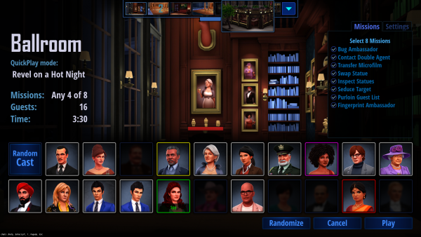
Here’s the finished4 version of the new merged game setup screen that will hopefully please all the people all the time:
That thing at the top is called the “level icon selector” and it slides down when you’re near it or over the level information on the side:
Miscellaneous Stuff
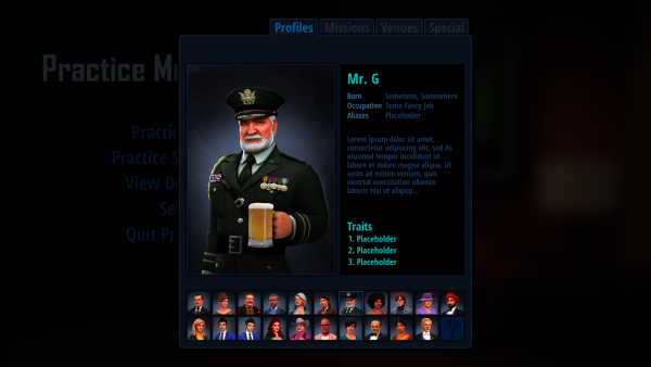
One thing you might have noticed in the gallery of new UI images at the top of this post is the Dossier screens. Right now, this is where the “practice preview” stuff went, where you can look at the mission tells from various angles and get information about the different Action Tests. This will be a big part of the deeper game eventually, including some crazy ideas partly inspired by Papers, Please.
Another somewhat interesting anecdote about how important real testing is: during development of the new UI, I setup and sometimes played hundreds of fake games against myself to test for usability and bugs, but it wasn’t until the UI was released that I actually played a real match (against steph for her 5k birthday and 1 year anniversary!) and I immediately missed something that should have been obvious in retrospect.
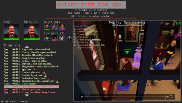
Before this update, when a game would finish by either a shot or timeout or the Spy completing missions, the replay for the game would immediately load. It was anti-climactic, but the replay screen includes lots of interesting information, as you can see:
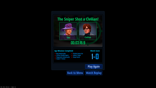
We aren’t going to redesign this screen for a while, and we wanted a cleaner and more dramatic results screen so there was a clear end to the game, so we designed this:
It’s nice and clean and has some animation, and adds the overall score from the match. However, it is missing the highlights and lowlights, which are usually the first thing I’d look at! As a Spy, you want to know if you were highlit or lowlit to know how much suspicion you had on you, and as a Sniper you want to know whether you had the Spy as a suspect even if you shot the wrong person or they won via mission completion. With this new results screen you have to hit the Watch Replay button to find this out. So, I’ll be adding “lights” to this screen soon, and I think that’ll be the knee of the curve for game results information.
Finally, here’s the original new UI reveal video, which has lots of information on the development and shows some early mockups too:






Nice work Chris, the update posts are much appreciated =)
Seconded. It’s fun to read about all the thought/considerations that go into this.
Looking _incredible_, Checker!
Any thoughts on bringing back Tuesday at 10? I enjoy hearing about the day-to-day encounters!
Can’t wait to see the next five characters!
-Clive
I definitely want to stream more this year, but I don’t know about a set time yet…maybe!?
I love your perfectionism and the fact you’re still plowing away at this game, it is starting to look incredibly polished. It’s one of my favored game concepts and I hope it will turn into a big success and find a wide audience.
I remember way back, at the time when you only had two play-testers playing the game fanatically (Ian and Paul I belief?) you mentioned that, although at that stage you were still only focused about core game-play-loop and depth, the game might actually be too hardcore and generate too much anxiety playing. Thinking about jumping back in I feel some reservations going into a hardcore group of players, I wondered if and how you the gameplay is being balanced at this stage?
Hey Jordy, it’s been a long time! :) The game is still pretty hard core, but the community is as nice as ever, so you’d feel welcome and they’d be happy to give you tips and do mentor games and whatnot. I’m worse now than I used to be because I haven’t been playing enough over the past year, but I still have a good time losing, and just try to not take it too seriously. I’ve got to start practicing again at some point before I work on more game design stuff, but for now I’m heads down on things like UI and the tutorial and other stuff that just takes time and typing, so I’ve let my skills slip a lot, but people in the community are cool about it. Come back whenever you’re ready, and good to hear from you again!
Hey!! I am just about to buy this. My only concern is that I will get it and no one will be playing. I just wanted to know how many people usually play now a days and I hope you understand my concerns.
Hi, yes, I definitely understand. It’s a small but active community, so usually there are between 2 and 15 people online depending on the time of day (see a graph here: http://www.spyparty.com/spyparty-beta-players.png), but you can usually hang out in the lobby and get a match in a few minutes at worst. If people are already in the lobby playing, you can either spectate their games, or play “spectation sniper” (which means you’re playing the same view as the real sniper, and can basically play the sniper game, the only difference being if the real sniper shoots before you, and the spy can’t see your laser), and there are sets of games the lobby will serve to you for sniper challenges. Old timers hanging out in the lobby are usually happy to do mentoring matches, too. The community is pretty helpful and friendly. Hope that helps!
Thank you so much! That is definitely the response I needed!