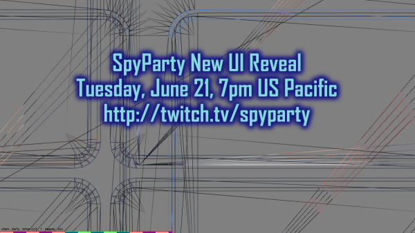
Finally Revealing the new SpyParty UI Tuesday the 21st, 7pm US Pacific!
I have put this off long enough…I’m going to reveal the new SpyParty user interface tomorrow, Tuesday, June 21st, at 7pm US Pacific time, on the SpyParty twitch channel, http://twitch.tv/spyparty!

A wire-frame teaser. I wanted to take another teaser screenshot but the game is not currently running or even compiling…uh…wish me luck for Tuesday.
Apparently 7pm PDT is 2am GMT…sorry about that! I’ll definitely put the video on the SpyParty YouTube channel line after the stream, so subscribe there if you want a notification!
We’ve been working on the new UI for a looong time, and it’s gone through a zillion iterations while we were mocking it up, then I started implementing it in a standalone test mode, and I’ve finally started hooking it up to the real game. My original goal was to not change any of the existing UI flow and just layer the new UI on top of it, but it became clear as we were working through the various issues that a bunch of stuff needed redesigning and smoothing out so it was more clear and simpler for new players, and while doing that it became easy to add a bunch of cool features for experienced players. So, hopefully the new UI will please all the people all the time…that happens sometimes, right?
During the stream, I’ll go through some of the mockups and iterations, I’ll talk about our process and reasons for making UI decisions and how we’re designing and implementing it, and I’ll show where we are so far. Some chunk of it (mostly having to do with game setup/loadout and results screens) should be available for beta testing fairly soon, in fact. The goal is to have a sizable chunk of it done for the Steam Early-Access release coming sometime this year,1 so people who buy SpyParty on Steam will get a video game that actually looks like a video game from the moment you launch it.
- I have just about given up on trying to give out time estimates for this… [↩]


