The New SpyParty Character Art Style
Update: the second batch of five characters have been revealed.
I am incredibly excited to introduce the new SpyParty character art style!
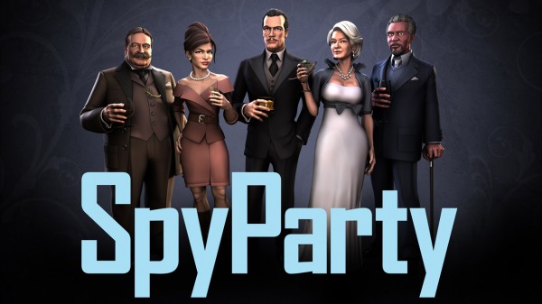
I am also incredibly excited to introduce the new SpyParty character artist, John Cimino!
Full disclosure: John has actually been working full time on SpyParty since September of 2011, we’ve just kept it a secret until we could reveal the new art style with a cool selection of characters representing some of the diversity we’re trying to achieve. It’s been hard to keep this quiet over the past year, and when somebody would ask me if I was making the game by myself, I’d answer “yes” and rationalize it on a technicality, since we haven’t actually put anything John’s done into the game itself yet!
So, it’s true, I have doubled the team size. This rate of growth simply cannot be sustained.
John and I worked together on Spore. I would develop some crazy mostly-broken system for skinning or painting or animating the creatures, and John would do amazing and beautiful things with it, and not hate me afterwards. After six years of that, I figured our working relationship had been battle tested, and so when I started working on SpyParty full time, I also started working on John full time, to try to get him to come work on the game.
John’s the perfect artist for SpyParty, because he’s amazing at all the artistic disciplines, from concept through modeling, texturing, and animating. While most of the industry is following movies and specializing roles to the point where an individual artist might only rig, or do textures, or animate, John can do it all. You need someone like that for indie games, and to have somebody this talented in all of those areas is amazing…I am incredibly lucky to have him, and so are you, since he’s going to help make the game the kind of “perfect jewel” that is the reason I’m indie in the first place.
The Style
We’ve spent months and months defining the style of the characters, and I’m really happy with the results. We call this style naturalistic and illustrative. With a game like SpyParty, where the design and gameplay aesthetics are all about deep subtlety, it was important that we hit that level of subtlety in the visual aesthetic as well. I want the visual and design aesthetics to work in concert to deepen the game. We also needed to skirt the Scylla of realism and the uncanny valley on one side, and the Charybdis of slapstick cartoon exaggeration on the other side.
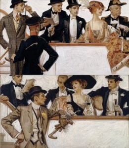
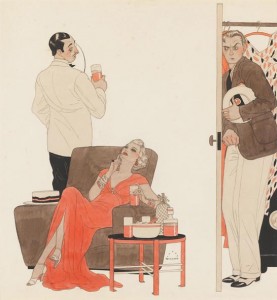
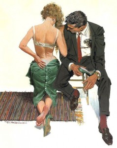
We call the result naturalistic and illustrative because it’s based on nature and sound anatomy, but without cleaving too close to realism, using instead the simplifications and stylizations perfected by classic illustrators, people like J.C. Leyendecker, Harry Beckhoff, Robert McGinnis, and Herbert Paus. We’ve spent days deciding exactly which wrinkles to include and which to elide on a just-past-middle-aged eyelid.
 |
 |
 |
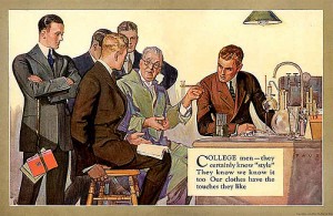 |
I want to explicitly thank my good friend Dan Zimmer, who publishes the incredibly beautiful Illustration Magazine, for introducing us to most of these illustrators.
Period
Talking about these classic illustrators brings me to questions of time period, and namely, “When does SpyParty take place?” The answer is, “yes.”
It’s important to me that the game’s visual design be timeless, not retro, not futuristic, but ambiguous, where it could be happening at any or all time periods. If you look at the collection of spy images I posted way back in September 2009, it’s very easy to visually date some of them, and I want to avoid that. I think 60’s retro spy-fi is as cool as the next guy, but it goes in an out of fashion, and it can be subtly alienating even when it’s in. My biggest inspiration for the timelessness we’re going for is Pixar’s film, The Incredibles.
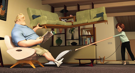
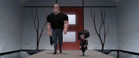
The art direction of that film is, well, incredible, and they did a great job of keeping the actual time period ambiguous…it could be the 50’s, it could be today, it could be the future. I want a similar vibe for SpyParty. If you follow the game, you’ll know there is gameplay associated with checking your watch. There will be characters who check wrist watches, characters who check pocket watches, and characters who check mobile phones, all integrated visually and mechanically in the same game.
Fashion
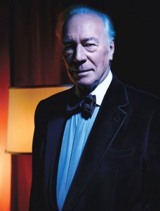
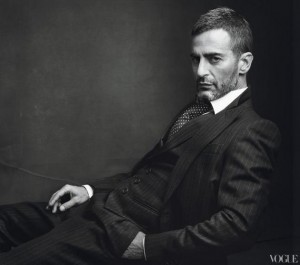
I’m guessing John and I spend more time on the clock than most game developers do discussing hair styles and shoes. Since SpyParty is not your usual orcs and space marines fare, we end up going to fashion magazines and celebrity red carpet blogs for a lot of inspiration and reference. I have a growing pile of tearouts from Vogue, W, In Style, Harper’s Bazaar, and Esquire. Here are a few images I’ve collected to give you a flavor of the kind of things we look to for visual inspiration:
 |
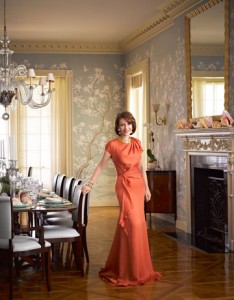 |
|
|
|
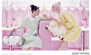 |
|
The Characters
Who are these specific people we’re revealing now? They’re going to have to remain mysterious for a while. Each character in SpyParty will have a dossier that will eventually be important to learn for playing at advanced levels, due to upcoming game mechanics involving individual behaviors and histories. For now, these folks are visual stakes in the ground as we explore the diversity of different races, genders, ages, abilities, sizes, and orientations that we’re going to put in the game.
These characters don’t even have names yet. For a brief while I considered using some of the names from the current beta characters, but I decided that would be disrespectful to the current guys, who have gone above and beyond the call of duty for the game. So, in deference to their service, I plan to “retire the jerseys” of all the current characters when the new art goes in. The new characters will have all new names, and I might crowd-source some of them, so put your central casting hats on.
The Game
And with that, we come to the question of when these new characters will go in the game. The short answer is, “not for a while.” These are characters that will eventually go into the game, but they’re currently at the initial stages of the very long production pipeline that comes with doing a high-end 3D game these days. These are high-poly-count models, and these images we’re revealing today are rendered with a non-realtime renderer. They still have to be decimated, and rigged, and textured and normal mapped, and animated, and the game engine needs to be redone to support higher quality characters like these. They are a long way off, sometime next year at least.
Finally, we come to the most important question of all, “What if the new art screws up the game balance?” I will not let that happen, or at least won’t let that happen for long. The deep and balanced game design is the absolute top priority, so if for some crazy reason I simply can’t get the game deep and balanced with different art, I will throw it all away and ship the ugly art that’s in the game now.
But, I don’t think that extreme will be necessary. I think we can make SpyParty a deep and subtle and beautiful game. Even once the game engine is ready to support the new characters, I will introduce them slowly in their own maps alongside the existing art, so we can make sure they don’t mess things up. I’m sure there will be some stumbles along the way, since perception is one of the key mechanics in the game and the new art will clearly impact perception, but we’ll figure it out and keep the game on the path to a competition worthy player-skill game.
What about the environments and objects? Those visual styles are yet to be determined, but they’re going to take a lot of time and thought, the same as the characters. The foreground-background separation is a key part of SpyParty, and the art style of the environments and objects needs to reinforce that.
Gallery
So, here are the new SpyParty characters. We love them and hope you do too!
Update: Their placeholder names until we name them for real—in order of appearance in the group shot—are Mr. C, Ms. B, Mr. A, Ms. E, and Mr. D.
Wallpapers
Here are high-resolution high-quality (read: large file sizes) images rendered out at various aspect ratios, so they should be suitable for even the largest desktop wallpapers, if your computer would like to wear them for a while.
And here are the high-resolution high-quality versions of the portraits. They’re 1000×1500 resolution:




Can’t wait to finally play this game. I love the chosen art style. Fits perfectly!
Absolutely beautiful. Kudos.
Maybe it’s just me, but downloading those wallpapers was a lot harder then i expected. Thanks for the update! Excellent news.
Yeah, I need to figure out how to turn off lightbox for some of the images! I’ll fix it!
Edit: Okay, should be fixed. All the wallpaper images should be normal links now, so easy to download.
Fantastic! I love that aesthetic. Totally worth leaving the box hands.
Do you have any intents on upping the size diversity in your characters? I noticed that your previewed characters are pretty poor in terms of size diversity, given that your only plus-size character is an older man (i.e. the stereotype for larger characters). In addition, both of the women have impossibly-small waists with larger hips, which is deeply problematic. They may not have large breasts, but they very much fall into the norm for portraying women’s bodies in animation, which is impossibly “perfect.”
I’m almost positive with @checker ‘s earlier comments that there is an intent to have a wide cast of characters for variety. I almost laughed when I saw the Taft dead-ringer. However, I think I have to address the comment you had about the women. I work for a clothing company and one of the things you see in a lot of the party dresses is a high waist. This is to provide the illusion of a much small waist and larger hips without having them. Here is two quick examples:
http://i.imgur.com/rU9QU.jpg
http://i.imgur.com/iHSUL.jpg
(although the lady in the jacket is a bit more exaggerated than the older lady)
Now, if we want to talk stereotypes, let’s talk drink choice! :D
Actually I think both female characters are proportional and different one to the other. while madame leBlanc here is actually quite busty, the younger one gives abetter view of her body build, both of them quite possible. what might be tricking you could be the darker colors around their wasted on their clothing. also, at this early stage variety and such its secondary to colour pallete and texture skins definitions. as they said it’s still a LONG way to implementation.
I just would like to point out the apparent style inconsistent between the boots and the dress on the young lady.
Yeah, there will be way more size diversity than just this. Having this be “the most diverse game evar” has always been at the top of my priority list, because it’s one of the first games where the diversity could be a) represented plausibly, and b) where it would make sense that it wouldn’t be an advantage or disadvantage, just different. The list of “diversity axes” I want to hit looks like this: races, genders, ages, abilities, sizes, orientations (I accidentally left “sizes” out in the original post, but I just added it, it’s always been on the list in my head, and in fact there are multiple plus-sized women and men in the current beta). I want to handle it really respectfully and tastefully, so feedback like this very valuable.
We tried hard to make the body shapes plausible in these characters, with multiple iterations on things like waist size and whatnot, but we’re not done yet, and this stuff with be tuned over time.
Ron: So… since their technical actual bodies might not have larger hips, it’s… what? I don’t quite understand your point. Furthermore, compare the younger woman with the man in the gray suit. Their heads are comparable in size, and yet the thinnest point of the woman’s body is only bit wider than her head, whereas the man’s head is about half the width of the thinnest point of his body. Even without the hips, the waists are still problematic. Heck, just try comparing the images you had with the renders–the real women’s waists aren’t as thin as the renders’.
JBantha: I didn’t say the women were the same. I said they both had thin waists and large hips. As for the rest of your comment, well, I can’t quite understand what you’re trying to say. Sorry.
Checker: Oh, awesome! I’m glad the preview characters aren’t indicative of the rest of them.
(Ugh. I’m trying to think of more to say and utterly failing.)
I just had to delete a rude comment in moderation on this diversity topic. I just want to be clear: if you haven’t posted before and you post something rude, I’ll delete it in moderation. If you have posted before and post something rude, I’ll delete it and set you back to moderated.
Yours,
The Management
@EmotedLlama It’s all good. I think that the exaggerated features are within artistic caricaturization. But yeah, avoiding negative stereotypes (or ones that cause negative impact unintentionally) is something that I hope stays a part of the design process.
I am LOVING these. It’s like I imagined it might be, but with all the details I couldn’t quite picture. I’m looking forward to seeing it in the actual game. I’m also going to try and make some more time to play the beta. I’ve been telling everyone I meet about this game.
Hey, I noticed that 2 of your male characters are handsome. Could you make them really ugly?
I know! Isn’t Taft so sexy!? The handlebar pulls it all together!
Are you trying to mock me or am I missing something?
This was in reply to dippyT’s comment (if you notice, it indents after dippyT’s comment). I actually replied to your comment too, but since I included a link in it, it’s awaiting approval. And no, I’m not mocking you, even though this comment is pulling the old switch-a-roo on expectations.
I was replying to dippyT, too, hence the identical indentation as your comment.
Okay, sorry, I’m just very paranoid. Very, very paranoid.
Oh, woops, the indentation is the same regardless.
Actually, yes, there will be lots of “ugly” characters too, at least as far as current celebrity/fashion-culture would be concerned! I’m totally serious about making this game incredibly diverse.
While I definitely appreciate some of the diversity, taking those remarks hand-in-hand with the “custom dossier for each character” worries me.
What’s your general ballpark-figure estimation for the number of separate distinct dossiers I’ll have to memorize at the risk of being handicapped?
Are we talking 100 different dossiers I have to “memorize”, or just 30? It’s hard enough for me to asscosiate real-life names with real-life faces of people I’ve met before! =)
Do you intend to limit certain (or all) characters to specific levels? I.e. will a Veranda-esque map have it’s own potential pool of characters distinct from a, say, Penthouse or Poolside map? Will there be any overlap in character pools between maps?
This is all far in the future, but it would be one dossier per character, and there aren’t going to be more than 30 characters, and probably closer to 20. I think right now the characters will all be available on all maps. Missions will be map-specific sometimes, but not characters.
Well, if there isn’t going to be more than 20 or so characters, you should definitely invest some time in outfits like you mentioned in a comment reply below. Having a ton of different characters and character appearances would add to the ambiguity of the scene. It wouldn’t feel like “round 2” all the time so much as, “new scenario, new VIP list, new objectives”.
Wow! What a treat! These are great!
Look forward to reading about how the introduction of finalised assets affects gameplay and the road of inevitable tweaks ahead.
It’s been a long time since I felt a game took its design of characters and ambience this seriously and with such success.
Congratulations! I feel you pulled off your desired style of classy ambiguity perfectly.
This looks fabulous! Like seriously, I am very excited. I’m so happy that the game is gonna look not ass, and is going to take up an AMAZING art style. There are only a few games that come even close to how awesome these characters look (Team Fortress 2, Dishonored, The Next BIG Thing). And it’s not just the art style that impresses me, it’s the character design itself, and how great each character is going to look, with their own distinctive styles and things (pocket watch, cane, glasses, camera). In the past, one would have to tell someone the premise and maybe explain the game a little for someone to be intrigued, but now, you just look at it, and you’d be like WOW. This game may be my game of the year. Can’t wait!
Awesome, glad you like it! The only question is, “Which year?” ;)
Cross my fingers 2013, but you seem like a perfectionist kinda guy, so possibly 2014, in which case it would be packed with content and levels and levels of complexity.
Do you think you would continue to design new maps and new content for the game past the final release or will you just release it and after fixing bugs and whatnot, leave it as it is and go on to your next awesome project?
How far into pure gameplay development would you say you are? I’m sure you plan on adding a few more maps, but in terms of objectives and things like that, how far along would you say you are, if you had to guess?
I’m terrible at guessing. 25%? Lots of game design things to do, lots of maps, characters, missions, tells, etc. Wheee!
As for post-launch support, I want this to be a competition-level game, so it’s going to have a lot of support after ship.
Sold!
I mean, I’ve been following SpyParty for awhile, but this moves it from intriguing to must-have.
Just woke up and read this. Thank you Chris, and especially John for this birthday present! It’s the best present I’ve received yet! :P
I’ve always wondered how you were going to approach the art style for this game. But now that I have seen it, it just makes perfect sense! I love it and I can’t wait to see more!
And a big Welcome to John as well! It must have been hard as hell keeping this secret for a whole year. Can we now expect to see blog posts from the two of you?
Yep, although John’s shy, so I’ll have to force him to do it. :)
Force him to talk to us on the forums too!
I vote Matilda Bernhardt for the old lady.
The art looks awesome and I can’t wait to see the re-skinned game. That said, I hope we’ll still be able to play the original version somewhere.
What are you going to do about gender-based “banana bread?” Will it give too much away if the gender of the spy is revealed? Could you include an imitation option for saying BB in the opposite gender? There’s a lot of potential for hilarity in mis-telling that, especially if you could make it dependent on whether or not the player messed up too early or too late. I’m thinking something along the lines of screwing up in “Love Rap” in Rhythm Heaven. http://www.youtube.com/watch?v=l5h3OQDNAZA
I’m still stewing on the gender solution to The Banana Bread Problem, and it’s a topic of conversation in the beta forums, but yeah, it’s going to take some finesse. Not sure what the right answer is yet.
Maybe you could have them play a recording of someone saying banana bread. Part of the animation could be the spy pressing a button under his or her clothing. Though I guess that would add another hard tell.
I’m so used to looking at the placeholder art, I’d started to think of it as the finalized stuff. After seeing this, though, I’m glad it isn’t–because that’s some very awesome work! I’ve liked that even the placeholder art had a distinct style, being sort of “spy” but not pinning it down much. This really keeps the same flair, just making the textures more detailed and high-res. If the rest of the game has the same look, it’s going to be a truly beautiful game.
One (very minor) thing I’m wondering about, though, is color. They all look kind of desaturated in the top pic, as opposed to the bright and colorful look of the placeholder art. Will other characters have some more of that brighter flair?
Yeah, there’ll be a variety of colors, and maybe even outfits at some point. The visibility of the characters relative to the background and each other is going to be a big thing to tune when the new art finally goes in.
Thank you Chris!
I love the incredible gameplay that the game has now, the art style is just icing on the cake.
Pretty great art style minus the fact that everyone pretty much has Skeletor hands.
Hands are hard! We’re still working on figuring out the exact style for the hands, how much detail to put in versus simplify, etc. We will probably do a blog post just about hands now that we’ve revealed the art.
Will we rig the models to work Source Filmmaker similar to using Team Fortress 2 characters? I would LOVE to be able to make movies with them!
They’ll all be normal rigged 3d characters, so as long as there’s a way to export from maya, it’d probably work.
Will I have to wait another year for a beta invite before I get some models and playtime?
No!
:D
Lastly, I know you’ve said compatibility takes a back seat to depth and design, but is Mac support planned at some point?
I hate to say it, but the insane awesomeness of Wineskin has made it so I don’t have to worry about a native MacOS support for a while, it already runs perfectly! It even auto-updates!?
This is incredible! So excited to see how it all ends up. And thanks for keeping up the long-form commentary; really a pleasure to read.
I like the idea of the current characters belonging to some distinct game all of their own. You’re right, that is respectful — bonus, it makes beta testers feel lucky to have known them.
I’m sure as soon as you put in the new graphics there will be an petition saying “We want the old graphics back!”
It is the internet, after all.
I absolutely LOVE the new art! It’s great. It’s amazing. It’s fantastic.
Good work.
About the dossiers, though. Don’t make it… too revealing, if you know what I mean. It’s is always nice to have to learn about these characters through playing, through observing. Little nuances and such that aren’t explicitly evident on the surface… You can get into the whole psychology angle! :D
Getting more excited by the day.
Yes, and I have to leave room for fanfic too! :)
These are absolutely stunning. Excellent work. Can’t wait to see them in action… or perhaps play the game with them :)
However, the simple, light-blue logo doesn’t go well with it. I would suggest stylising it a bit.
Is it in-game or baked lighting? Looks great.
The post said this was not in-game and not done with a realtime renderer, if you read it.
Very not in-game. They’re rendered with mentalray. It’ll be a while before they’re in-game, but these are the real models that will be put through the pipeline, decimated, normal mapped, rigged, etc etc.
Nope, I’m one of those guys who skip text to just watch pretty images :P Thanks for answer
Yea, I get it. I just thought it may be rendered in game engine, all of it can be achieved in real-time except high resolution soft shadows…
Yeah, it’s going to be a trick to keep the minspec low, but the good news is SpyParty doesn’t have to render an entire city or do any culling, so it’s almost best-case for doing high detail characters.
Ah, I envy you. I’ve tried to make a 3D game before, but I was dumb enough to choose a design requiring a lot of on-the-fly optimisation and culling ;)
I just realized that the cane might be an interesting game mechanic. You have one less hand to use, so you won’t be able to transfer the microfilm and check the time while at the window at once. You can’t transfer the microfilm or bug the ambassador while holding a drink, etc.
Also, if you at some point add a camera that looks at the sniper’s victim from a bird’s eye point of view, civilians should just bleed out, but if you shoot the spy, the spy should drop a statue, microfilm, in addition to bleeding.
Wow so excited about this! I hope the environments are equally cool! Have you thought about what type of lighting the game will use, toon shading, realistic light mapping, etc?
I’m going to try to get it as close to those renders as I can.
Looking pretty good! The only complaint I have is that the young woman’s knees need some work. They…don’t look anatomically correct.
I hope you do implement that mode that has police showing up to arrest the spy when you pull the trigger. I don’t want to shoot these people.
Yeah, I almost certainly will. They’ll be security guards, not police, though. I want to keep it ambiguous who’s on which side. :)
This is an interesting idea. I hadn’t thought of anything like this for the game play.
That sound bite of the snipers shot is staple to my previous Spy Party experience. I know the game is going to change and that’s great. I’m not saying It should stay the same, but there is something I like about that silenced shot. Adding a non lethal option may have a return for players like yourself who don’t want to kill their target. If John and Checker haven’t yet started on this idea I would suggest maybe adding a non lethal option through a tranquilizer dart. this option would probably take less time to make and may still provided the desired virtuous option. Just change the death animation to I fall down slowly and add a dart projectile. Just a thought.
I am excited for what is coming next.
vyrus0139
what about a dart? could be simpler to make and still provide the same effect. just a thought.
Also Are the guards going to provided any other function than taking down the spy after he/she is “marked”. Maybe you could add a different gameplay type where this “style” of victory has a more evident reason. And then you can give the user the option to always use this “style” of victory if they want.
So ya either do even more work, or do less Haha.
Loving the work btw.
Vyrus0139
PS. if you are wondering what I mean by a new game type ask and I’ll further explain. i’ve got some ideas.
I’m hoping to eventually have a mechanic where the Sniper can ask the security guard to go interrogate somebody!
I vote for a “Chris Hecker” character with his own dossier =)
Very cool – I love the style! I would suggest doing a pass to make them look less like actual, known people though. It seems like it could be distracting. Also, Taft and Vincent Price are already dead, but there may be issues with your players sniping Morgan Freeman.
We actually de-morganized him twice, but he may need more de-morganifying.
Just click the de-morganify button in Photoshop for goodness sake my good man!!!1!1!!
:3
These character models are better than I ever could have hoped for. Will the maps be as equally stunning?
Also having lots of diversity eases the burden on the sniper. I know countless times (Less than the number of games I have played), I have been confused as to which suited man or which thin women was by the bookshelf acting suspicously and will tend to shoot characters that don’t stick out more often than I should.
Yeah, the maps will be awesome as well. They’ll have to be less attention-grabbing than the characters, obviously, but they will be no less beautiful, hopefully.
So I tried to ask before but I think my comment got filtered: How (interactively) detailed are you planning to make the facial expressions and body language? Will guests visibly react to strange behaviour from the spy (eg raised eyebrows, looks of amusement, disapproval etc) or would this make the sniper’s job too easy?
I’d like to have subtle facial animation, so you could tell the difference between a joke that’s funny and one that flopped, for example.
Sweet. Keeping a close eye on this.
Finally had a chance to play the beta. Enjoyed it a lot. Very interested to see how more detailed movement will affect the gameplay in the future.
Well, if you’re shooting for ” not retro, not futuristic,” then I’d say the first image you posted from ‘The Incredibles’ is probably the worst possible inspiration you could have picked. It’s very much both. Furniture from this era is used in The Jetsons, sorta the pinnacle of what we view as futuristic. Plus, it’s super trendy right now.
All of that furniture is mid-century modern, both the chair and sofa look Danish.
Quick and dirty googling found pics of actual pieces these look like;
sofa: http://www.dejavulongbeach.com/sold-items/danish-sofa/8456107
chair: http://furniturebyljindustries.com/seating/#.UMnGM3fULg0
The coffee table a modified Adrian Pearsall 1960’s atomic table, maybe inspired by this one:
http://www.objectculture.com/modhaus-secure/detail.asp?id=13894
He did sectional and platform sofas, too, so the whole room may well have been inspired by him.
So weird that you’d specifically call out the ’60s as an era to avoid, because that is exactly what the picture depicts. It’s ‘Mad Men’ without the suits. Not saying it’s a bad style or you should nix it. It just struck me as funny that you framed it the way you did.
Yeah, their house was totally mid-century modern, but Edna’s place was from a totally different period, the bad guy’s place on the island was different too, etc. The way they mixed the different time periods together was awesome. I mean, it’s not even clear if their house was actually in the mid-century, or they just decorated it that way because danish modern is so trendy, etc.
I don’t want to nix the 60s, I just don’t want to be pigeonholed in the 60s and feel “retro”. I want some retro, some future, some present, and I want the blend to be “timeless”.
Alright, I’m okay with Snaps not being in the final game’s parties, but some other paparazzi member better show up. Please?
Snaps is really useful for playing spy against Viri.
Or have his style of camera in the background of one of the final design maps and with McGee scribbled on the side. But in a display case. Because Snaps was (is?) that important. And the amount of dust on the camera could specify how long ago the beta parties were. That doesn’t count as dating the game, does it?
That would happify me. And Viri. And Snaps. Ya know, if you have some spare wall space.
There will definitely be paparazzi at the party, with flash bulbs!
The guy with the moustache is THE BEST. More of him!
Awesome work, just purchased beta, having shit load of fun.
Awesome, thanks!
Wouldn’t the women be holding their glasses by the stem?
Nah, do an image search, there’s a lot of variety in how people hold glasses. For example: martini glass wine glass champagne flute
I accidentally deleted spy party how do I get it back?
No worries, just log in to your beta homepage and reinstall. Mail support at SpyParty dot com if you have problems!
But I don’t see a login button or anything ANYWHERE can you direct me to it
Hi there.
So am I correct in assuming that some of the new designs have a flavor of Archer ? Most specifically the older woman. When I see the artwork I can hear Malory Archer loud and clear :-)
Anyway, superb work. Keep it going.
T.
Yeah, the funny thing is we actually didn’t think about the Archer connection until we released the images and people pointed it out, but in hindsight it’s pretty obvious! The other one like that we missed was the film Red, which has a similar cast! Thanks for the kind words, and we hope to reveal the environment art soon!
Hey Checker, how about the new Level-Art i saw on some websites? I would love to hear some stories about those screenshots ;)
Yeah, I need to write up that post…had to go to a wedding this weekend!
Just came back to spy party. It is great to see how the work is going. I Love The New Art! I think this Style meshes very well with your game play. I am A big fan Of your game I hope you are able to succeed in your efforts. great addition to your team! Kudos to you both and may success follow you.
VYRUS0139